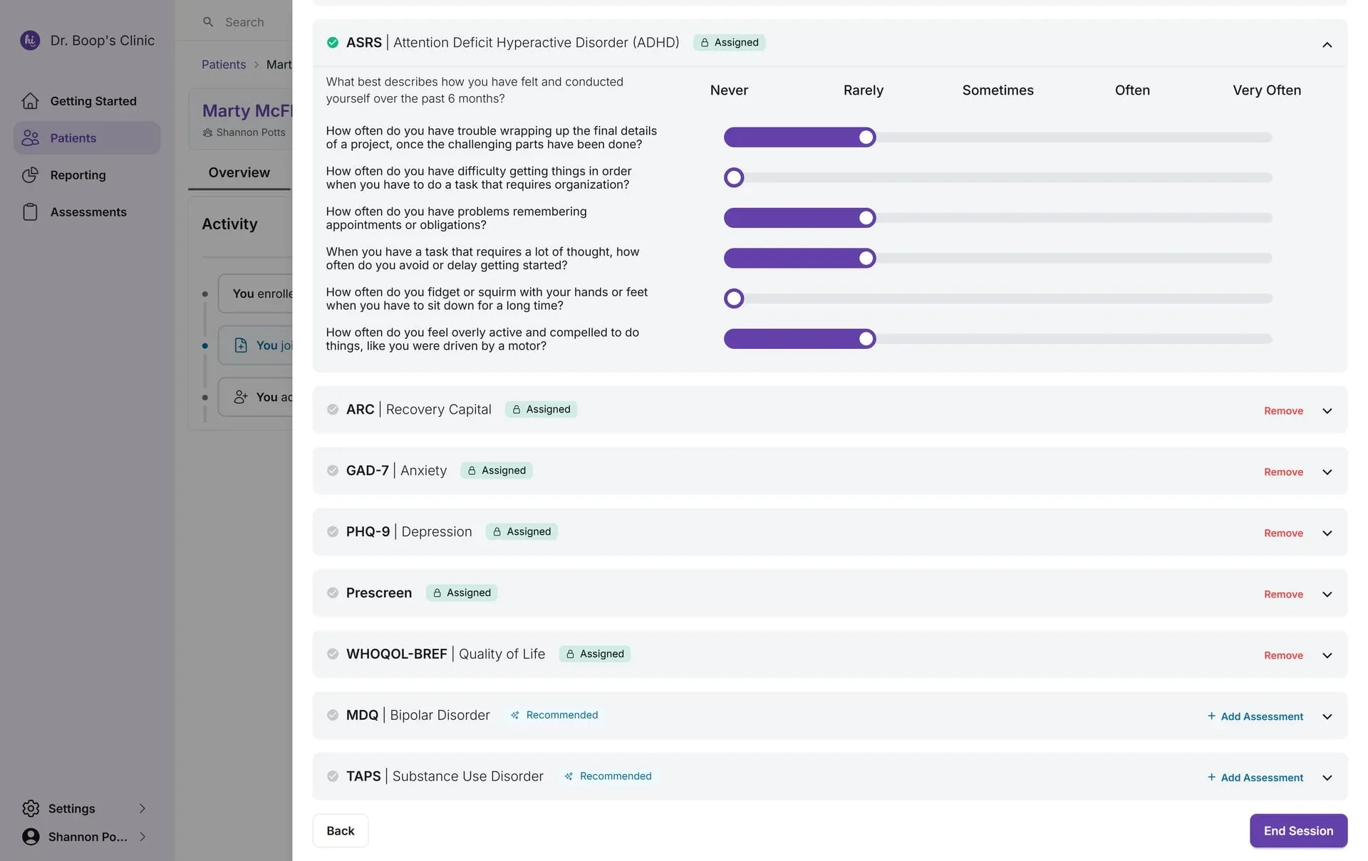
We’re excited to introduce a redesigned Clinician Mode assessment experience that makes every assessment session more intuitive, organized, and efficient. This update brings a modernized layout, clearer guidance, and new controls that help clinicians move through required and related assessments with confidence and ease.
This is the first step in a broader initiative to support more consistent workflows and deeper measurement-based care across HiBoop.
The assessment session layout has been rebuilt for clarity. Instead of navigating long, continuous forms, required assessments now appear in clean, collapsible sections. Each measure, such as the GAD-7, PCL-5, or ASSIST, is grouped into its own card with a consistent structure.
What this improves:
- You can open and close assessments as needed without breaking your flow.
- Sessions feel more spacious and manageable.
- It’s easier to review completed and pending sections at a glance.
This structure is especially helpful when sessions include multiple measures or when clinicians make mid-session decisions to add or remove assessments.
Every assessment now displays a status badge indicating why it appears in the session:
- Required, must be completed before ending the session, unless skipped.
- Related, algorithmic signals or screening logic suggesting it may be helpful
These labels help clinicians quickly understand the priority of each tool and reduce guesswork during live encounters.
The redesigned assessment view features:
- A smoother, more responsive slider for each item
- Clear anchors for all scoring options (Not at all → Nearly every day)
- Better spacing, contrast, and readability
- A consistent question layout across tools
- Lock icons for when an assessment question was answered by a patient
This creates a more comfortable, predictable workflow, allowing clinicians to move through items quickly while maintaining accuracy.
If a question is not initially editable (such as when a client pre-completed it), a lock icon appears to remove ambiguity. This can be overridden and the overwrite action is logged.
Each assessment now includes clearly visible action controls:
- Remove an optional tool
- Skip when clinically appropriate
- + Add Assessment to introduce additional tools mid-session
These controls make it simpler to adapt sessions on the fly, especially during complex intakes, evolving conversations, or when new concerns emerge.
A new Show Recommendations toggle lets clinicians decide when to view system-suggested assessments. This allows you to stay focused when you prefer a streamlined view, while still having access to guidance when it’s helpful.
The session footer now uses clearer and more intuitive actions:
- Back, return without losing progress
- End Session, complete all required assessments and proceed to summary
The improved structure reduces uncertainty at the end of the session and accelerates your workflow.